In the long process of designing a website, we find ourselves in front of a big step where it’s always a bit challenging to contain the client’s creative exuberance. If while talking about SEO the risk of running out of caffeine in the office is very high, when we talk about choosing colours the level of attention and engagement increases drastically.
This shouldn’t really come as a surprise: colours are the result of the emotional side of our brain and they do have an incredible communication power. We do know that colours don’t exist as such, but it’s our eye that absorbs light through the retina and translates the information to the brain in a “colourful” way.
Each colour then, besides the social and historical connotations, has a very specific connection to a particular part of the brain that triggers definite emotions.
Neuromarketing and Brand Identity
If human beings made the use of colours possible to cure themselves, such as chromotherapy, for instance, they also found a way to use them for other pretty impactful reasons. But what does happen when we mix marketing with colour psychology? The result is a very fascinating branch of neuroscience called “neuromarketing” and its goal is to tell us what happens in our brain processor every time we expose ourselves to triggers generated by brands, products etc.
This is where a particular emotion is attributed to colour and, in literally a handful of seconds, the user will produce an emotional judgement about the website they are visiting. Colours are the very first thing we communicate and while designing a website, it is crucial to know where they stand in our brand identity.
The Language Of Colour
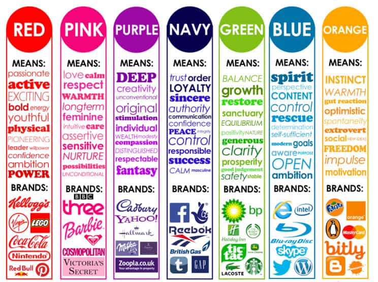
It would be a tremendous advantage to find the perfect guide to the perfect website colour scheme, however, things are not as easy as we want them to be. Matching colours by business type can be quite simplistic nowadays, but it comes handy to have something to relate to. We know the colour that is most used among logos and websites is blue because of the substantial amount of positive meanings it has as well as being very relaxing for our eyes.
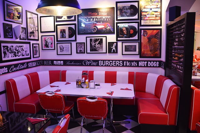
Everything depends on the brand website’s ultimate goal, what we wish to communicate and how we want our users to feel while navigating through the website. As for wall painting, bold colours can make our heartbeat go faster and therefore, are not really appropriate for bedrooms or relax lounges, but they can be perfect for restaurants as they trigger appetite.
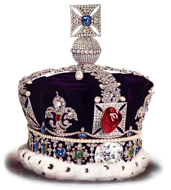
Besides these very basic distinctions, we need to consider the cultural connotations of colour. Each culture and country has their own vision of the world, of symbology and emotions, so that it’s not unlikely to find a whole different meaning for the same thing in two different nations. It would be the case of purple which in Italy is perceived as a grim and unlucky colour, while in the UK it’s a symbol of wisdom and royalty. For this reason, if you have specific business goals in terms of less known locations, make sure you consider the cultural background of your target demographic.
Corporate Colour
There’s one thing that can’t be avoided when choosing the colour scheme for your website and that would be the corporate colour, the one that’s usually in the logo and other aspects of brand identity. Using the corporate colour as the main character in the palette is certainly the most common choice, but all depends on the brand identity stability and integrity.
When the logo is quite old though, it’s not unlikely to encounter some design issues. For instance, metallic shades like gold and silver can be very tricky to manage in a palette and the same thing applies to very dark or very pale colours that can make the whole design very flat and not engaging at all.
So, if rebranding is not a viable option, we need to rely on taste and try to combine those difficult colours to something that can actually help them shine. In the case of a very dark blue, the solution might be to match a light colour and then something bright, bolder, which can create some nice contrast without being too much.

The Whole Palette
Unless we’re not designing a black & white website, once the main colour has been found, it’s time to develop the extended palette and, even if it might seem odd, it’s not that strange to not know what’s a good match. How can we gather good ideas? Easy peasy: google, google and google again. There is an extensive choice of free websites that allow you to generate your own palettes and to move around colours randomly so you can see in real-time what fits and what doesn’t.
As per usual, there’s no secret recipe for perfection and in the end, it will only be up to the designer and client’s taste. A warning though is in order: as for clothing in fashion, design is something that changes constantly and for this reason, it’s always better to prioritise the website structure, content and the psychological side of your users before choosing colours. Fashion is a stream flowing way too faster than your website design, you better not risk having an already old website the day it comes out.